With its intuitive and user-friendly interface, Sage Intacct makes it easy for users to access and manage their financial data. In this blog, we will explore the various features of the Sage Intacct user interface and provide step-by-step instructions on how to navigate them.
To begin, the home screen is the default for the entire system. There are several important areas of the home screen to know and understand in order to maximize your benefits with Sage Intacct.
Applications Menu
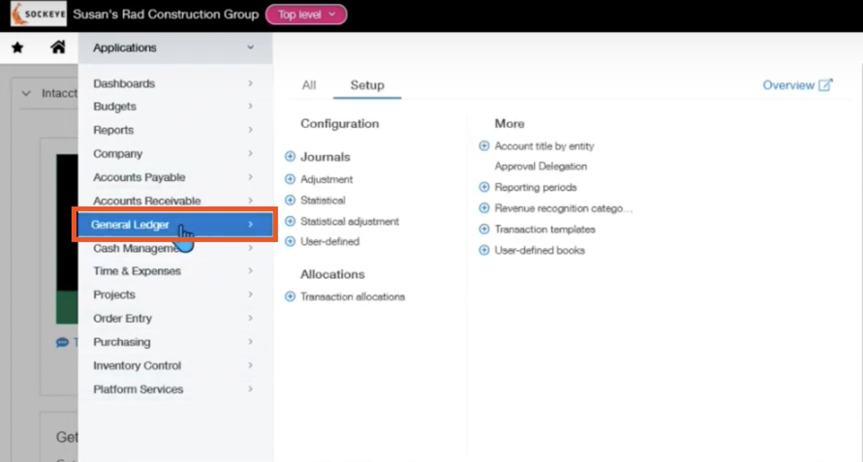
Some of the important areas are in the applications menu. This gives you access to all of the modules. You have the ability to change the layout of these modules by dragging and dropping them. These modules are only visible if the user has permissions. If they have administrative abilities, they can see the All and Set up menus as well.
In each module, you have an all and a setup menu tab along the top.
For example, navigate to the general ledger through the applications menu.
Setup Menu
Within General Ledger, you have the setup menu which is where configuration lives and where you can create several different data objects.
You also have the overview which takes you to an icon representation of the different points within the selected module.
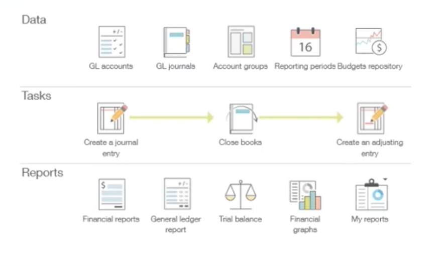
Each of these are able to be selected by clicking, but it exists to see an overview of the workflow within an environment.
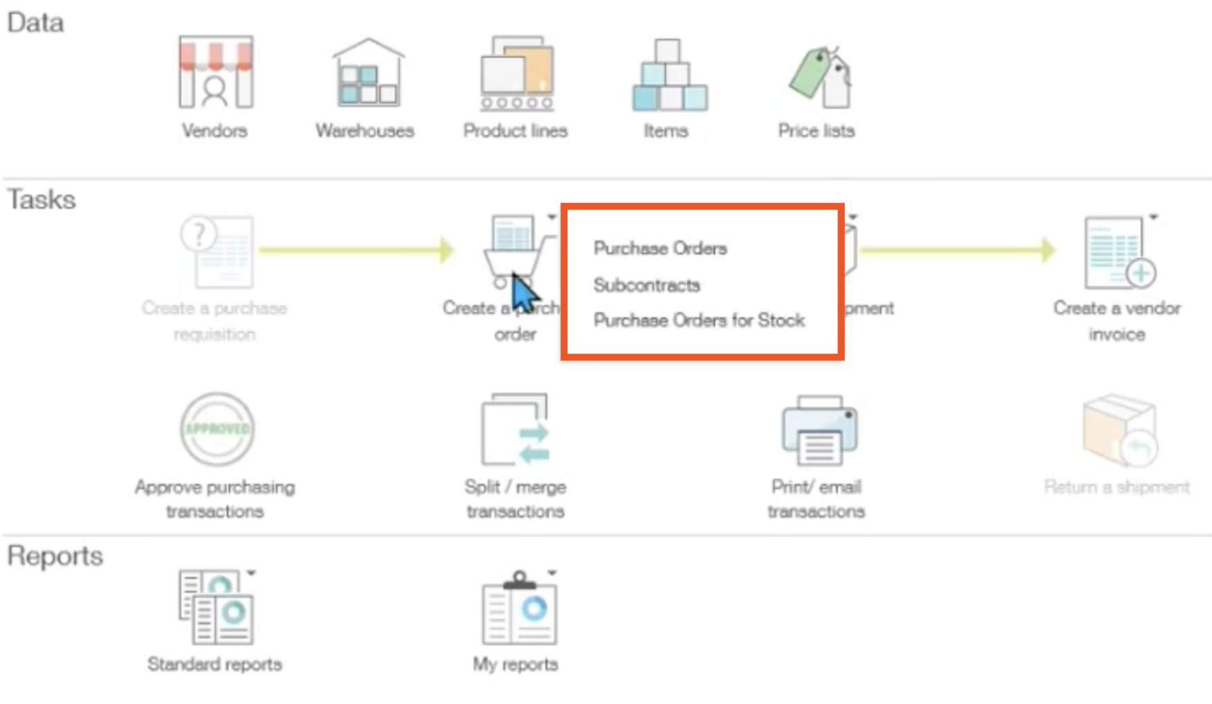
An icon representation is especially helpful under purchasing from the applications menu. When you click on the icon, it shows you which transactions are within each of the steps.
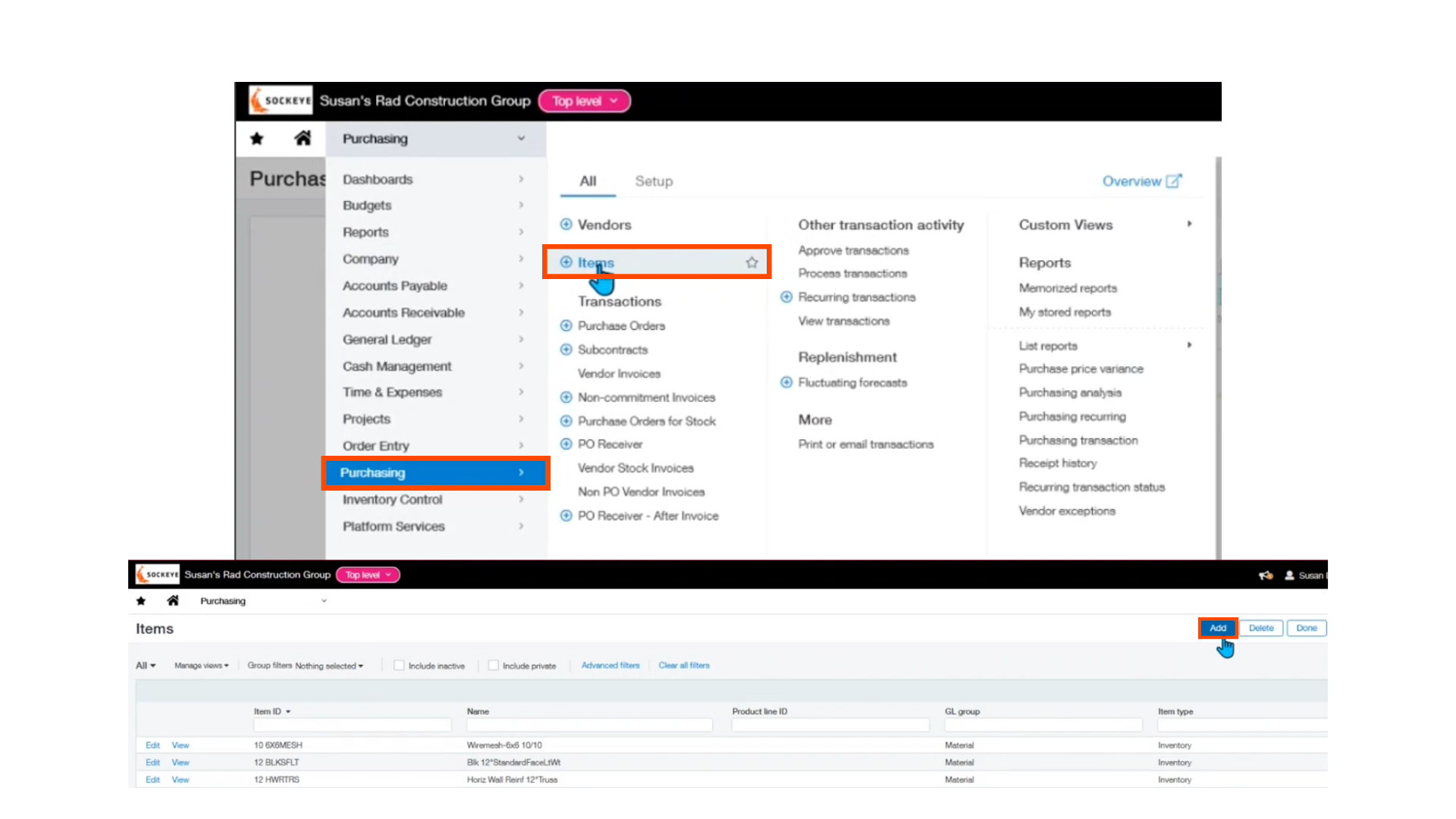
If you navigate back to the menu, you will see there is a combination of plus signs and words.
Words can all be selected by clicking and it will take you to the data object.
If you click into a word on the menu, you will see an add button at the top right, which allows us to navigate into the creation of that item.
There is also a plus sign, which will do the same thing. Both are very efficient ways to get to those data points.
Favorites and Bookmarks
Going back to the home screen, there are two really helpful tools for navigation. First, is the favorites bar.
This is going to be any of the application menu items that you want to quickly access.
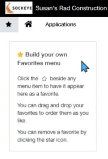
To add an application to your favorites or shortcuts, you will go back to applications, choose the general ledger, and press the empty star that appears next to an object.
Applications > General Ledger > Star
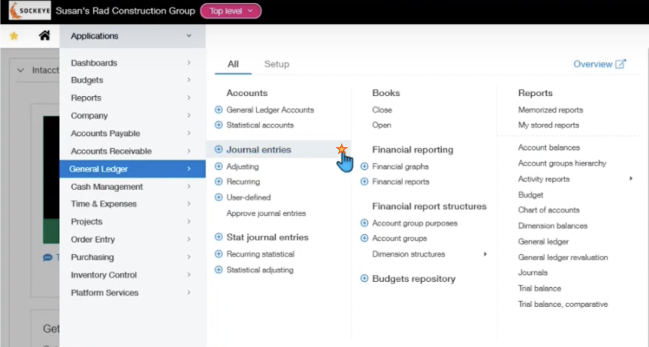
You can also bookmark, which is slightly different from favoriting.
If you select the plus sign, it allows you to pick any journal and directly enter a journal entry.
However, if you go into the journal itself, you can bookmark them and they will appear in the bookmarks tab on the homepage.
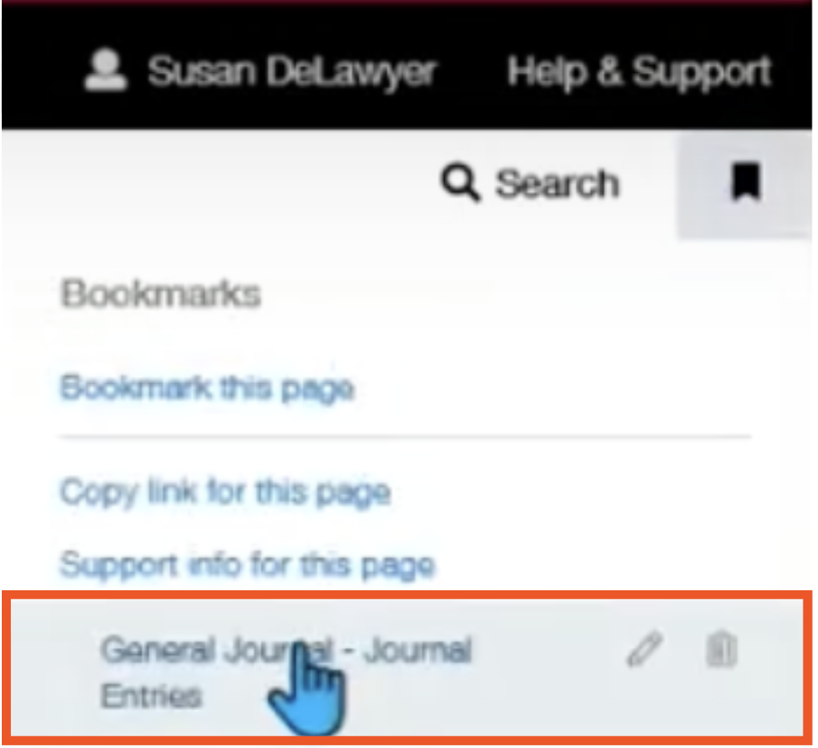
Both favoriting and bookmarking are beneficial depending on workloads for individual users.
System Personalization
Next, we will cover ways to make your system more personalized to your organization.
If you go into company > company information, we have the ability to order all of our applications.
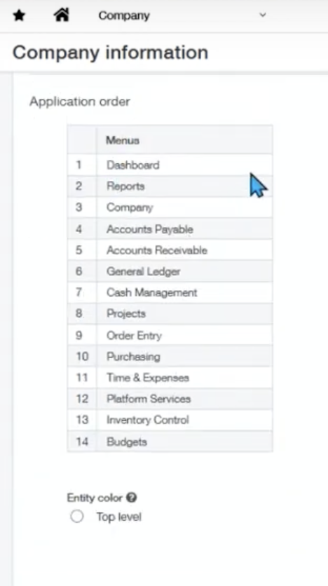
You can also set the color for the top level as well as set defaults for the language, time zone, and date format.
NOTE: As an administrator, you can set preferences for individuals or they can set their own preferences.
You can also choose to have individuals not start on the homepage and start elsewhere instead. For example, if it is more relevant to an individual's work to start on a dashboard, they are able to do that. That will be done by navigating to:Company > Admin > Users
One tip that can make a difference in the user settings, is to set the views to the maximum of 999. This will allow you to see all items of the list on one page rather than switching through many pages with only 20 items per page.
Entity Vs. Top Level
The last section of navigating the user interface is entity versus top level.
The top level requires a certain permission, but it gives transactional information to all entities as well as the ability to do journal entries. There are various entities that are available under this top level.
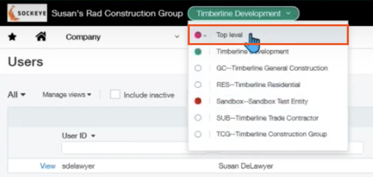
Each user has the ability to set a different color, which can help with organizing and keeping track of what you are working on.
You can enter into entity level by clicking into any of the entities under top level in the previous screenshot. The color coding is an easy way to segregate information and know which entity you are working under.
It is important to note that at this level, you are only able to work on entity-level information.
The users can also be restricted by entities so that they can only see certain entities selected by the admin.
Overall, the user interface of Sage Intacct is designed to be user-friendly and intuitive, providing users with easy access to all financial data they need. By following the steps and using the tips and tricks from this blog, users can quickly and easily navigate the Sage Intacct user interface and take full advantage of its many features and capabilities.
Please feel free to reach out to one of our Sage Intacct experts if you have any questions or want more information.
About the author
Susan joined the Sockeye team as a self-starter Senior ERP Consultant with more than 50 Sage Intacct implementations under her belt. At Sockeye, she specializes in the construction and real estate industry, while also working on implementations in the airline industry as well.
Susan Delawyer, ERP Solutions Architect
Watch the Video Overview of this Topic
View a video presentation on this topic here and browse through more Sage Intacct Tips & Tricks on our Video Insights page.
